
The Easy Way to Add Image Borders in Squarespace
If you’ve ever tried to add a simple border or shadow around an image in Squarespace, you’ll know… it’s not exactly obvious. There isn’t a neat little “add border” button sitting there waiting for you. But there is a really easy workaround once you know the trick.
The secret? Using a shape block behind your image.
Let me walk you through it.
The basic idea
Instead of styling the image itself, you’re layering a shape behind it and styling that.
Think of it like putting your photo on top of a frame rather than trying to draw the frame directly onto the photo.
This approach gives you way more control too - borders, outlines, shadows, offsets - all without touching code.
How to create a border around an image

1. Add your image block
Start by placing your image on the page as normal. Nothing fancy here.
2. Add a shape block
Now add a shape block and position it behind your image.
Resize it so it’s the exact same size as your image
Use the grid to align it neatly (this part makes a big difference visually)
3. Send the shape behind the image
Right-click (or use the block controls) and move the shape backward so your image sits on top.
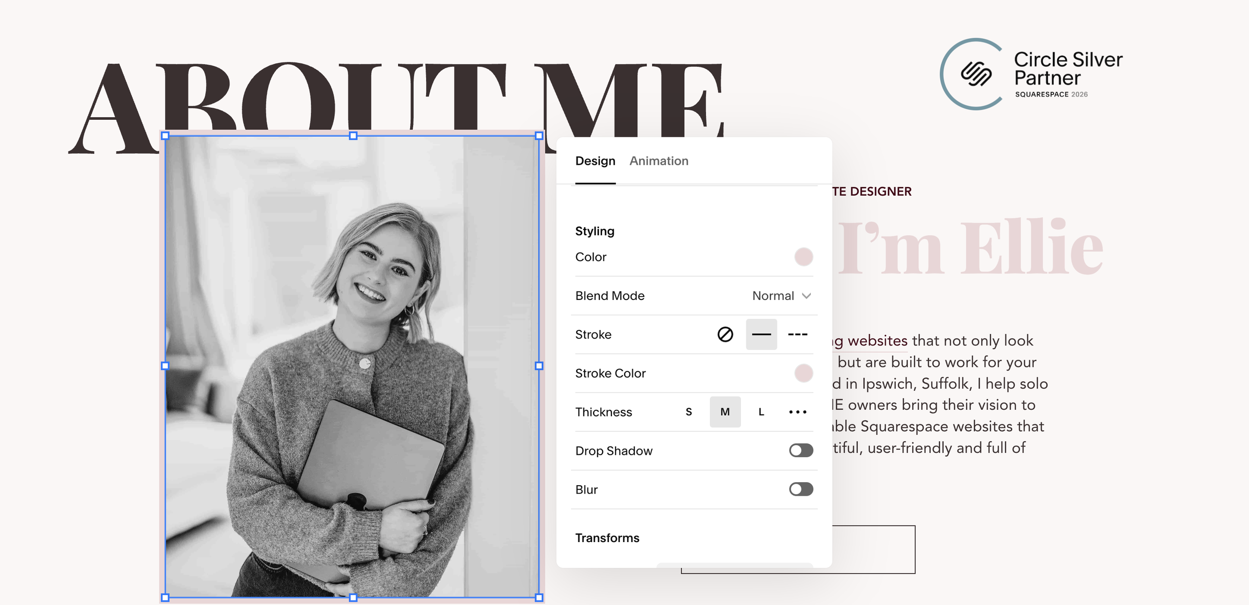
4. Style the border (this is the key bit)
Click into the shape block settings and:
Turn fill off (or set it to transparent)
Turn on the stroke (outline)
Adjust the stroke width to control how thick your border is
Choose your stroke colour
Here’s the important setting:
Make sure the stroke is set to sit outside the shape.
That’s what creates the illusion that the border is wrapping around your image, rather than cutting into it.
How to create an offset border around an image
This effect uses exactly the same setup - you’re just switching from stroke to shadow styling.

1. Duplicate your shape setup
You can reuse the same shape block behind your image.
2. Turn off the stroke
Disable the outline so you’re starting clean.
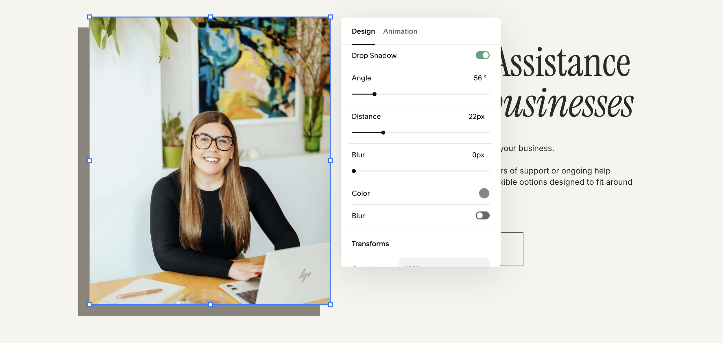
3. Enable shadow
Now switch on the shadow option in the shape settings.
From here you can tweak:
Blur/size (width) – controls how soft or strong the shadow looks, go for 0 blur here so your shadow is solid
Angle – changes the direction of the border
Distance/offset – how far it sits from the image, also how thick your border will be
Colour/opacity – keep opacity at 100% for an offset border style
A couple of quick tips
Keep spacing consistent
If you’re using borders on multiple images, make sure your shape sizes and stroke widths match. It keeps everything looking clean and intentional.Use this creatively
You’re not limited to plain borders - try using a variety of brand colours for something more bold than just white.
Why this method works so well
Squarespace doesn’t give you deep styling controls on image blocks themselves, but shape blocks are much more flexible.
By combining the two, you basically unlock custom framing without needing CSS.
Once you get used to it, it becomes second nature - and you’ll probably start using shape blocks for all sorts of little design details across your site.
That’s it — simple trick, big difference. Once you start using it, your images will instantly feel more polished and intentional.