
Designs I’m LOVING at the moment 💗
If you’ve been anywhere near the world of web design recently — or if you’ve worked with me — you’ll know I love keeping an eye on design trends. Not in a “let’s follow every shiny new thing” way, but in a what’s actually working right now kind of way.
Because good design isn’t just about looking nice. It’s about how a website feels to use.
So today, I wanted to share a few design elements I’m absolutely loving at the moment — the ones I keep gravitating towards when designing Squarespace websites, and the ones that clients keep reacting really well to.
If you’re planning a website refresh (or just nosy, which I fully support), this one’s for you.
Scroll Animations (But the Subtle, Grown-Up Kind)
Let’s start with scroll animations — because yes, they’re still very much a thing.
When they’re done well, scroll animations make a website feel interactive, polished, and modern. When they’re done badly… well, we’ve all experienced the chaos. The key is subtlety.
I’m loving:
Gentle fade-ins as you scroll
Elements that slide into place naturally
Text that appears just as you’re ready to read it
Not loving:
Things flying in from every direction
Animations that slow the site down
Anything that makes users feel seasick
On Squarespace, scroll animations are such a powerful tool when they’re used intentionally. They guide the eye, break content into digestible chunks, and make a site feel more premium — without screaming “LOOK AT THIS ANIMATION.”
Basically: animations should support the content, not distract from it.
Oversized, Chunky Text Headings
Big text is having a moment — and honestly, I hope it sticks around.
Oversized headings immediately grab attention and give a website confidence. They say “I know who I am” without needing loads of extra decoration.
I especially love using chunky text headings to:
Break up long sections of content
Create strong visual hierarchy
Make key messages impossible to miss
Paired with plenty of white space, large headings make a site feel clean and intentional — not cluttered. And when combined with a more minimal body font, the contrast works beautifully.
This style works particularly well for service-based businesses because it allows you to say things clearly and boldly, without overwhelming visitors with walls of text.
Big words. Clear message. Job done.
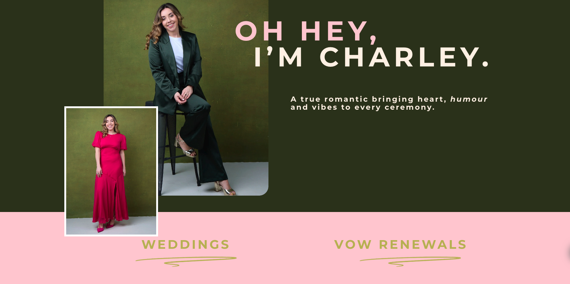
Mixing Image Shapes (Yes, All of Them)
This is one of my favourite trends right now — and one I’m using more and more.
Instead of sticking to just square images (hello, early-2010s websites), I’m loving designs that mix:
Sharp square images
Soft rounded corners
Fully circular images
All used together.
When done properly, this adds visual interest and movement without feeling messy. It makes a website feel custom and thoughtfully designed — not like a cookie-cutter template.
The trick here is balance. You still need consistency in spacing, alignment, and colour, but varying image shapes adds personality and warmth — especially for personal brands and small businesses.
It’s one of those things visitors might not consciously notice, but it absolutely affects how a site feels.
Thin Scrolling Bars for Accreditations & Certifications
You know those thin horizontal scrolling sections that quietly move across the screen? I’m all here for them.
These are perfect for showcasing:
Accreditations
Certifications
Tools you’re trained in
Brands you’ve worked with
Memberships or partnerships
Instead of dumping logos into a chunky grid (which can feel a bit… dated), these slim scrolling bars feel modern, understated, and confident.
They say “Here’s my credibility” without shouting about it.
I especially love using these sections between larger content blocks — they give the page a natural pause, add movement, and subtly build trust while people scroll.
Overlapping Images Between Sections
Overlapping elements are such a good way to make a website feel layered and high-end.
Right now, I’m loving:
Images that slightly overlap the section above or below
Photos that sit partially outside their container
Content that feels like it flows rather than sits in boxes
This breaks away from the rigid “section by section” feel and makes a site feel more dynamic and custom-designed.
On Squarespace, overlapping images are a great way to elevate a layout without overcomplicating things — especially when paired with neutral backgrounds and simple colour palettes.
It adds depth. It adds interest. And it makes people want to keep scrolling.
Why These Design Choices Actually Work
None of these trends are just about aesthetics.
They work because they:
Improve visual hierarchy
Make content easier to digest
Guide users naturally through the page
Create a more memorable experience
When a website feels modern, intentional, and easy to use, visitors are more likely to trust the business behind it. And trust is what leads to enquiries, bookings, and sales.
That’s always the goal.
A Little Reality Check (Because Trends Aren’t Everything)
While I love experimenting with design trends, I always say this to clients:
Not every trend is right for every business.
The best websites blend:
Current design styles
Your brand personality
Your audience’s expectations
My job isn’t to force trends onto a website — it’s to use the right elements in a way that feels natural and aligned with you.
When that balance is right, the result is a site that feels current and timeless.
Final Thoughts
Design trends come and go, but the ones I’m loving right now all have one thing in common: they make websites feel human, confident, and easy to navigate.
And honestly? That’s exactly how a good website should feel.
If you’re thinking about refreshing your Squarespace site and want something that feels modern without being overdone, these are the elements I’ll probably be very excited to talk to you about.